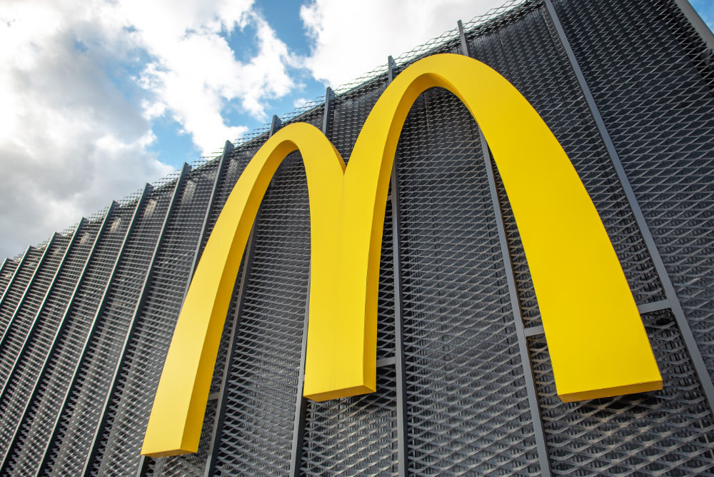
Close your eyes. What are some of the most iconic images that your mind imagines (even if you haven’t seen them in person)? Mine are the Grand Canyon, the Statue of Liberty, the Eiffel Tower, and the McDonalds arches. A fast food logo. Seriously.

All hail the golden arches
I’m not a psychologist, though, to my credit, I took a semester of psychology in college. This means that all seemingly profound insight into the psychological aspects of logos is a mixture of experience as a human being and not a psychologist and merely opinion.
Colors In a Logo
It’s no secret that colors can help guide your emotions. Marketers have been able to use colors to influence purchasing decisions since the beginning of time. Or at least, the modern era.
Take red for example – most people will think of things like stop signs, fast cars, and ferocity. Blue will instill a sense of calm and trust. Yellow and orange bring excitement and freshness into the mix.
Choose your colors carefully. Think about your brand and the image you want to portray, and from there, you’ll be able to filter out colors that you wouldn’t want and focus on the one(s) you do want.
Font
Uppercase, lowercase, ALL CAPS, cursive, the list goes on. Not all companies use text in their logos, or they have standalone versions of their logo that don’t include any text.
Regardless, if a logo has text in it, the font is very important. What would Coca-Cola be without its iconic cursive font? Probably not the $180 billion+ company it is today.
The Hidden Meaning Behind your Logo
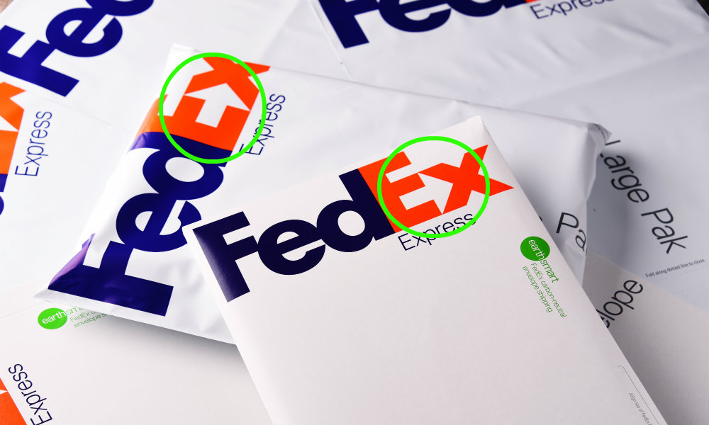
Not all companies put in hidden symbols in their logos. *cough cough* FedEx…

See that arrow? I found out about that a couple of years back, and I haven’t been able to unsee it since.
Even though your logo may be wholesome in its intent, you surely want people to feel a certain way. Whether it’s trust, energy, or you like how it jives together, and you think other people will as well. Trust your gut, but always get a second opinion and make sure it’s not an echo chamber. You don’t want to be Gavin Belson in the latest season of Silicon Valley. (I’m leaving it at that, I’m not one for spoilers)
Examining the Donovic Media Logo
What better logo to inspect than the Donovic Media logo?

Believe it or not, only about half of the people that I’ve talked to about it have noticed that the image with the search glass in it is a capitalized D. The search glass signifies search engine optimization which is at the core of why the business was founded. Blue is my favorite color, but it’s also a calming color. Finally, the font is all lowercase with Donovic in bold.
The nice thing is, your logo can be whatever you want it to be, and mean whatever you want it to mean. I hope this not-quite-a-psychological-thesis article helped you with deriving meaning from logos, even your own.
Need help designing a logo?
I can help you design a simple logo, or connect you with the best logo designers I know.
