

If you’ve been following web design trends over the last few years, chances are that you’ve heard the term responsive web design thrown around here and there. You’ll also be aware that responsive websites have virally grown in popularity after the last few years as well.
Responsive Web Design 101
First off – what is responsive web design in layman’s terms? One definitions is when your site is scaled across multiple devices to take full advantage of that platforms and its strengths (and limitations), and it involves fiddling around with the code of your site (such as the CSS) to allow fluid scaling across browser sizes and platforms.

Using Donovic Media as an example, this is what you see (well, unless something is wrong with your browser…) when you pull up the site on your desktop computer or laptop. It looks kind of snazzy, don’t you think?
Long gone are the days that one is stuck stagnant like a pond in front of your CRT screen burning pixels into your retinas. We’ve transitioned to primarily using laptops, netbooks, tablets, and mobile phones. Society has become a lot more mobile in general. Not only are we commuting longer distances due to urban sprawl, but we’re utilizing our phones for just about everything: GPS, tagging yourself on Facebook, paying your bills on the go, and viewing your favorite websites when your work computer is being tracked for non-work activity. (Not that anyone is being unproductive at work in the slightest…)
So, if you were to take a look at your favorite site on your phone, it’d look something like this:
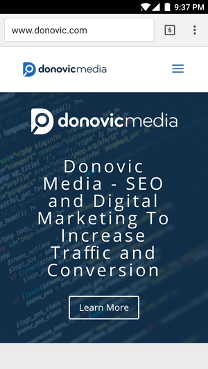
As you see, you don’t have to pinch and zoom. It’s perfectly optimized to be viewable on your mobile device. The menu at the top bar is condensed to a single area so all you have to do is tap and select the page you want to navigate to. If you were viewing the desktop version of a website on your phone, it would end up being a pain. You’d have to zoom in and tap to get to any page and it wouldn’t be such a fluid and seamless experience. This is an example of responsive design.
Cool tip: While reading this on your desktop computer or laptop, make the browser screen smaller. Drag your browser’s size down to what you’d essentially see on a mobile phone. Look familiar? Looks kind of like the mobile site. This is great news when you’ve got limited browser space and need a few sites open at once!
“Responsive Site Design Seems Like Just A Trend” – Random
Whoever may be saying something like that truly isn’t a future-thinker. There’s no reason to think that you won’t have a need for a responsive site, whatsoever. Though it’s true that “only” 17.4% of global web traffic comes from mobile phones, it is WAY up from the 2012 figures of 11.1% (Do the math – it’s ridiculous [in a good way])
Whether you like it or not, mobile web browsing is on the rise. The question is though, is your site prepared?
Is Integrating Responsive Design Difficult?
It can be, but it’s worth it.
Luckily, WordPress, Drupal, Joomla, and other CMS’s are fully prepared for this. Their open source nature allows for people to modify, expand upon, and just plain go crazy with innovation. If you’re a seasoned web designer with extensive experience in CSS, you could tackle it yourself with a little bit of time, patience, and learning. If you’re the average Joe building a website, you can consider responsive themes to fulfill your needs as well.
It will improve the user experience and will lead to overall end-user satisfaction, as well as improve rankings. When you’ve got a site that people are happy using, then that’s more important than an improvement in rankings. (Note for the paranoid: It won’t detract from rankings either – in fact, Google encourages responsive site design!)
Conclusion
It goes without saying, technology and user innovation improve every single day. That fact is clearly visible when we view the improvement in technology over the last few years. With open source CMS’s and plugins, there’s no limit to what changes are to come in 2017 and beyond!
